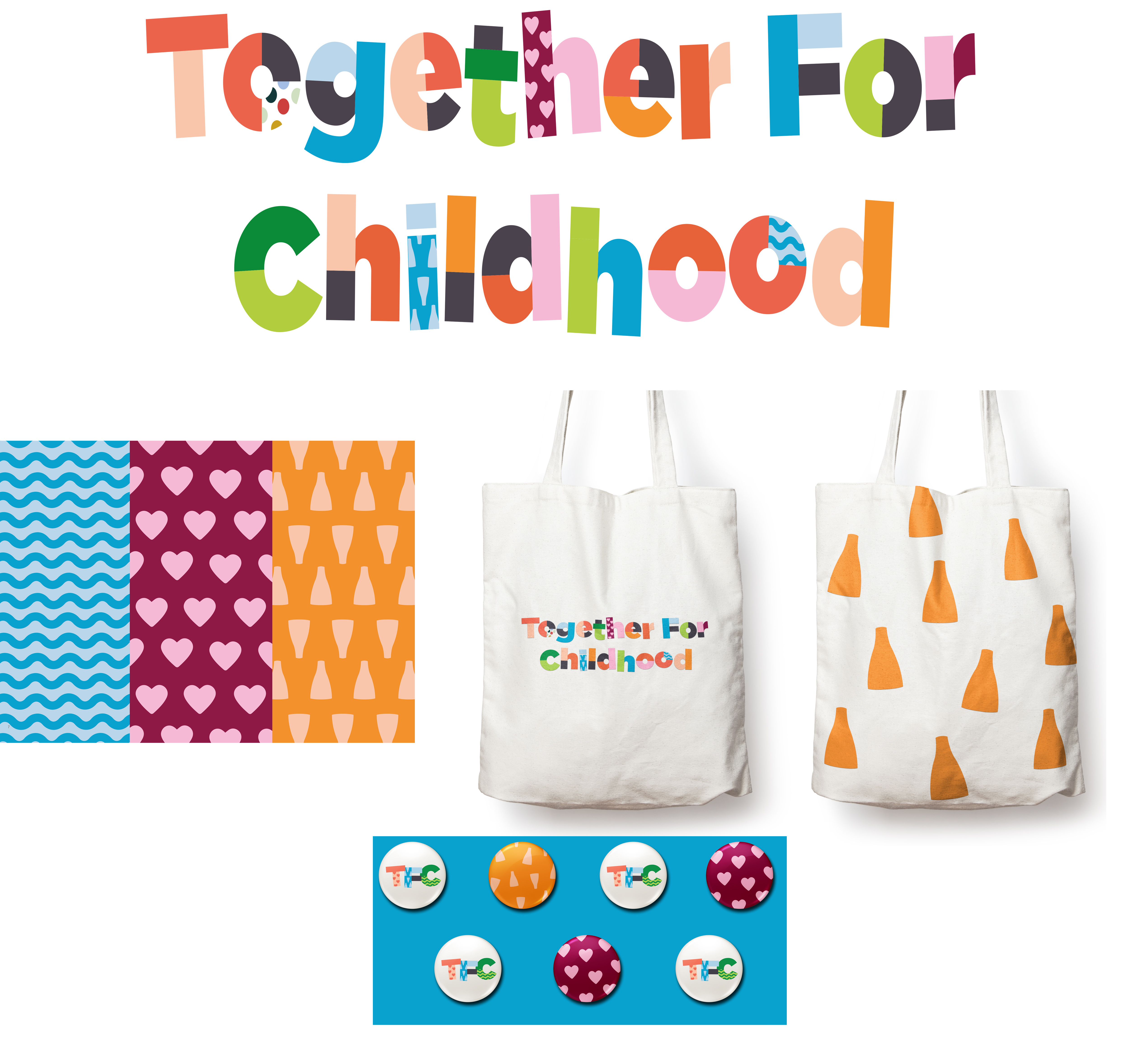
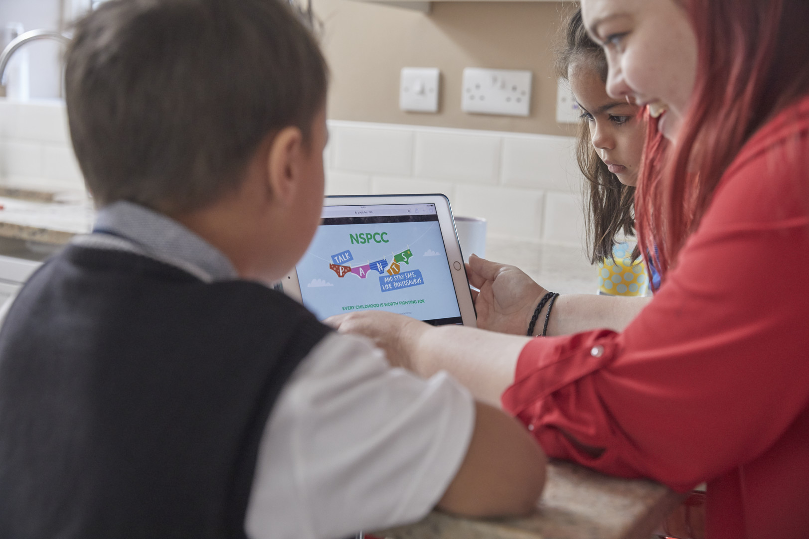
We’ve had the design concepts through for Together for Childhood, click through here to our Facebook page and add a comment or ‘Like’ to your favourite:
https://www.facebook.com/stokenorthbiglocal/posts/2499436420331770
-
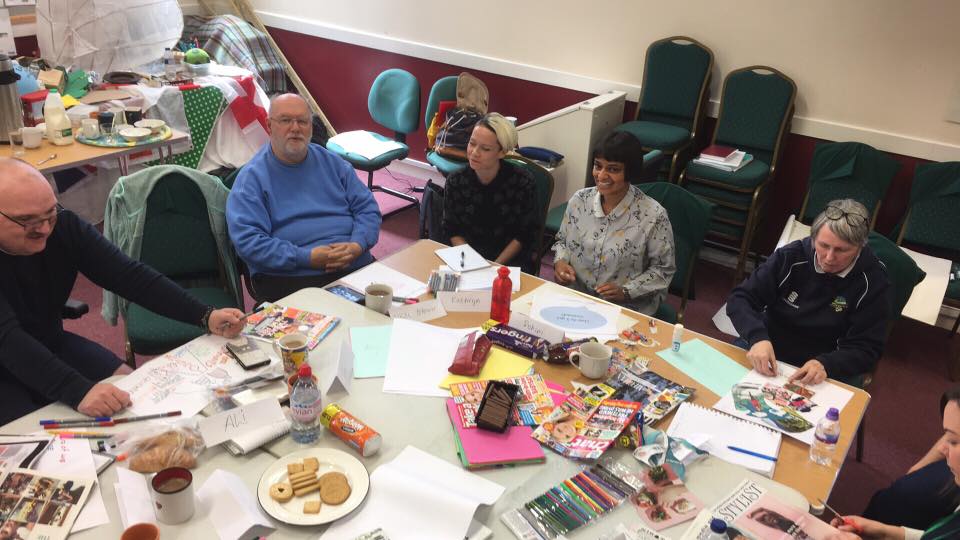
- 1. Collage. This route was inspired by the creative hands-on approach taken by the local people of Stoke-on-Trent. Drawing from the area’s rich pottery heritage, as well as the togetherness of the community, this route really captures the essence of Stoke.
-
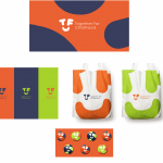
- 2. Smile. Having mentioned words like kindness, positive, pride and happiness in the workshop we wanted to create an ident that starts to encapsulate the friendliness/caring nature of the area. The ident also uses these letters to create dynamic and playful shapes.
-
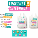
- 3. Highlighting the cause. We have some powerful emotive words in our name and our cause. In this route we have the ability to highlight these key words, and any further messages that are created in an expressive, youthful and playful manner. Our three marks and colours remind us of the three areas and the way they overlap symbolises speak of the team work that goes into to helping young people.